Button
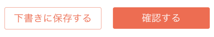
オプション指定なしでもイメージするところのいわゆるボタンっぽいボタンが簡単に出来ます。
<Button
  title="確認する"
  buttonStyle={{ backgroundColor: 'tomato' }}
/>
Image

これがいいのは読み込みが完了したタイミングでふわっと表示してくれる。 タグの中にテキストを置くだけで、画像の上に文字を出したりできる。
<Image
  source={{ uri: image }}
  style={{ width: 200, height: 200, resizeMode: 'contain' }}
  PlaceholderContent={<ActivityIndicator />}
/>
ListItem
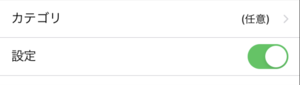
タイトルと表示や入力項目を左右でレイアウトしてくれます。 アイコンやオンオフのボタンも作れて、設定画面なども作りやすい。 FlatListの項目として使うのも良い。
<ListItem
          title="カテゴリ"
          bottomDivider
          chevron
          onPress={}
          rightElement={<View>(任意)</View>}
        />
<ListItem title="設定" bottomDivider switch={{ value: true }} />
Input
デフォルトでアンダーバーが付きます。アイコンなどもつけられます。
<Input
          placeholder="Email"
          leftIcon={
            <Icon type="simple-line-icon"  name="envelope" />
          }
          containerStyle={{ marginTop: 16 }}
          keyboardType="email-address"
          returnKeyType="next"
          value={email}
          onChangeText={(value) => setEmail(value)}
 />
Icon
複数のアイコンライブラリの切り替えがしやすい。 ライブラリ名とアイコン名を指定すると使えます。
<Icon type="FontAwesome5" name="store" size={64} color={'white'} />